REDESIGN APP INTERFACE OF MAKEMYTRIP
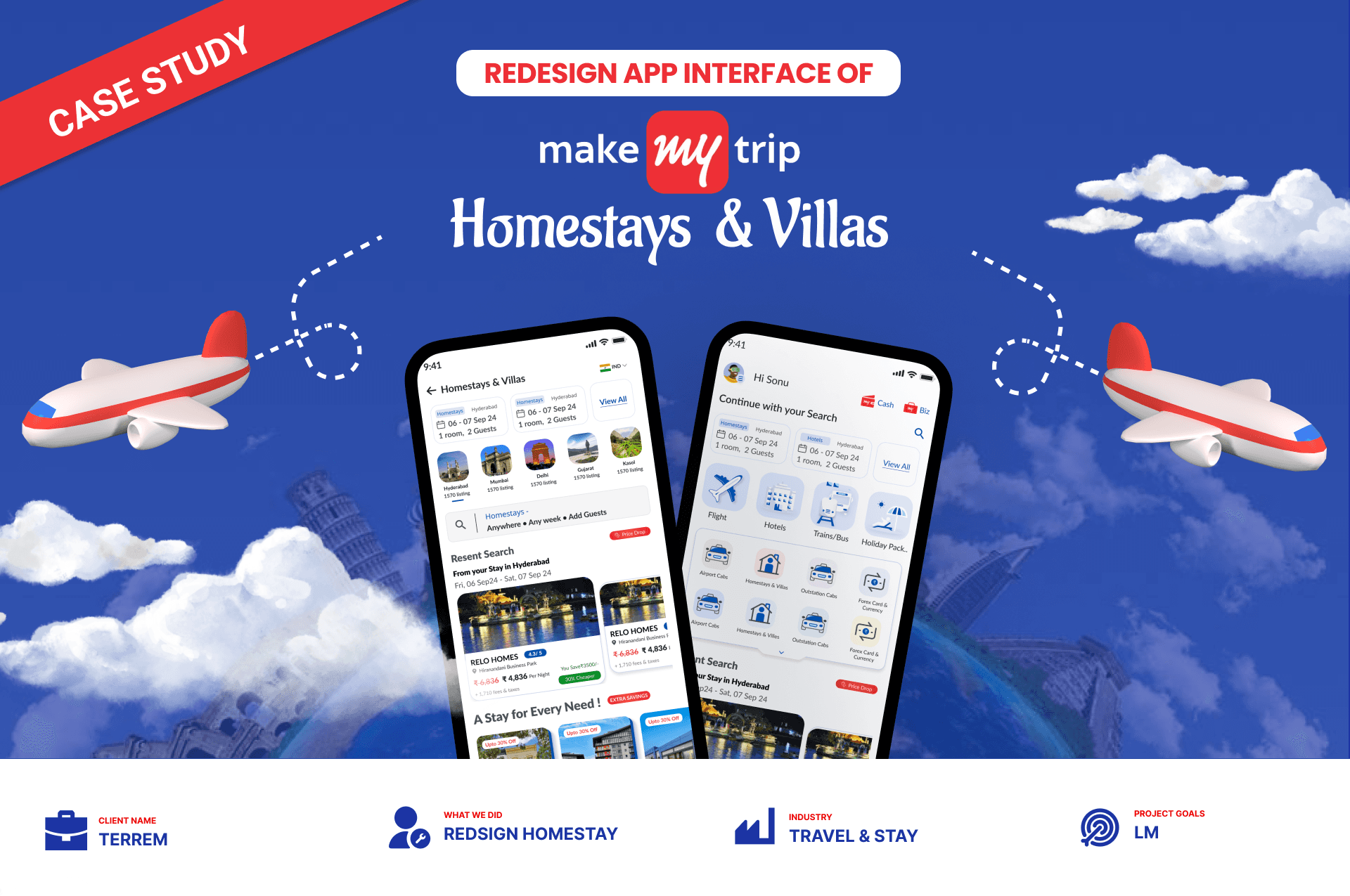
The MakeMyTrip Homestays & Villas project focuses on enhancing the user experience for booking homestays and villas. The goal was to improve the search and booking process by identifying pain points in the current interface and redesigning specific sections to be more user-friendly, efficient, and visually appealing.


WHAT WE HAVE DISCOVERED & DEFINED
Search & Filter Issues.
Unclear Search Bar Placement: The search bar was not prominent, leading to confusion on where to start the booking process.
Insufficient Filters: Users had difficulty narrowing down their options due to a lack of easily accessible filters, resulting in a longer and more frustrating search process.
Visual Hierarchy Problems
Poor Grouping of Services: Key services (like filters, discounts, and offers) were scattered, making it difficult for users to focus on the most critical features.
Ineffective Iconography: Icons lacked prominence and did not visually stand out, which reduced the overall usability of the interface.
Ratings Overlooked: Users found it challenging to locate important ratings due to their size and placement within the interface.
Content Placement & Usability Issues:
Misplaced Recent Searches: The "Recent Searches" feature was located far from the search bar, causing disorientation. Users had to scroll unnecessarily to review their search history.
Excessive Scrolling: The amount of scrolling required to access critical content was significantly higher compared to competitor apps, leading to user fatigue and a higher likelihood of abandonment.
Property Review & Comparison Problems:
Overlapping Information: Too much information was displayed in a cluttered way, leading to confusion about key details like price, features, and amenities.
Offers Not Highlighted: Discounts and deals were buried within the interface, making them hard to compare across multiple listings.
Payment & Checkout Issues:
Price Comparisons: Users found it difficult to easily compare price breakdowns, payment options, and cancellation policies.


Conclusion
The redesign of the MakeMyTrip Homestays & Villas interface tackled multiple user pain points, resulting in a more intuitive, visually appealing, and user-friendly booking experience. By focusing on improved visual hierarchy, optimized search and filtering, and a simplified payment flow, the project successfully enhanced both user satisfaction and platform engagement.

